Thought Piece
How to create a mood board for a video project

Video is a dynamic medium – a marriage of audio and visuals, with immense room for varied creative expressions. As you hash out your project in the early stages of creative development, there may come a point when you realize that you’ve done a lot of writing (for the treatment, script, etc.).
Enter the mood board – a chance for you to put down the pen and communicate your ideas visually. If you’re familiar with those aesthetic image layouts on Pinterest or Tumblr, you know what we’re about to get into.
What is a mood board?
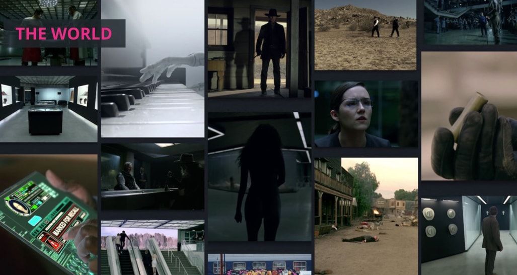
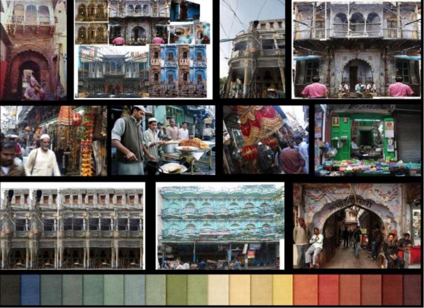
Mood board: a collage that expresses the look and feel of a project. Also known as an inspiration board, theme board, or idea board.
Mood boards are handy design tools used not only in film and video but also in fashion, photography, graphic design, interior design, etc. A bit like scrapbooking, making a mood board involves putting together a set of already existing images and/or objects to represent the world that you seek to create with your project. One look at a mood board should be sufficient to communicate the aesthetics and atmosphere you’re going for.
What role does a mood board play in video pre-production?
Creating a mood board ideally happens after the creative brief, treatment, and script but before the storyboard and shot list. You’re still in the relatively early stages of pre-production at this point, but you’ve got bare-bone ideas to work off of, and ideally some meat as well.
The purpose of a mood board is threefold:
- Creative exercise in brainstorming, finding inspiration, and/or narrowing down your ideas.
- Tool to communicate your creative vision to others (i.e. clients, creative collaborators, other team members).
- Guide to reference as you move forward with the development of your video.
What makes a good mood board?
A mood board can be a powerful tool as part of your pitch for a film or video project, whether you need to secure funding, present to clients, or convince potential collaborators/cast/crew to join your production. Looking at a mood board is faster than reading over a script, treatment, or creative brief. It packs that visual punch that, if done well, can appeal to your audience on a more visceral level.
Mood boards are still creative pieces; you can’t really identify one as being right or wrong, but you can deem it effective or ineffective. An effective mood board should be clear, efficient, and ultimately inspiring so that people will want to support or get involved with the project.
What elements of a video should a mood board communicate?
Simply put, the visual elements. As mentioned, the mood board functions as a useful reference throughout pre-production and even during shooting. Think of all the departments that need to be covered (casting, location scouting, cinematography, lighting, production design, etc.) and translate those into visual cues.
- Characters
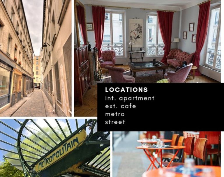
- Locations
- Time period
- Architecture
- Set design
- Key props
- Color swatch
- Cinematography (shot sizes, angles, etc.)
- Lighting
- Wardrobe
- Makeup
- Visual effects
- Text (e.g. lines from the script, using fonts that evoke the feel of the production)
- References from similar projects (e.g. popular films, shows, or videos from which inspiration was drawn)
How to make a mood board for a video
1. Identify your approach: The most important thing to consider is who you’re presenting the mood board to. Know and tailor your approach to your audience.
- Consult with your creative collaborators and come to an understanding of what the necessary base ideas are, and to what extent you can branch out creatively while assembling the mood board.
- If you are working with a client, make sure you take into account their style guide – this will inform color tones, typography, logos, etc.
- Consider making a series of mood boards, each covering a different area of production (costumes, makeup, lighting, cinematography, production design, location, etc.), or even a separate mood board for each character. This can be particularly helpful for presenting to department heads, or simply for clear organization of ideas.
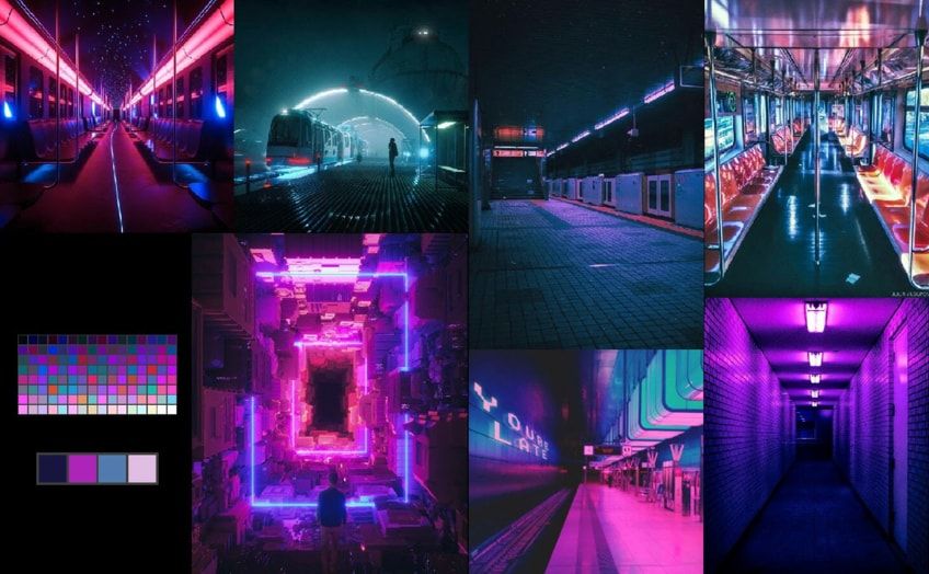
2. Identify your medium. Physical or digital?
- Physical: The classic stick-photos-on-a-board method. With this approach, you can incorporate physical textures (e.g. materials that evoke costumes or props), newspaper/magazine clippings, or any other visual samples that can’t be accessed on a computer.
- Digital: As simple as assembling images in a Word or PowerPoint file; otherwise, there are a variety of mood board apps, websites, or browser extensions that offer templates, image sourcing, and sharing capabilities. Going digital in this way can give you access to expanded photo libraries to browse and pick from, as well as ease of collaboration between team members. A digital mood board also gives you the option to add more dimension with moving elements (e.g. videos, GIFs).
Digital tools: GoMoodboard, Canva, Milanote, Niice, Adobe Spark, MURAL, StudioBinder. Some services are free, while others require a paid subscription at some point. Social media sites like Pinterest or Tumblr are fair game as well.
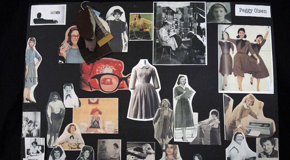
3. Brainstorm a theme and/or keywords: Get your creative juices flowing. Identify the ideas you want to build your mood board around, which will double as image search terms. Think style, colors, genre, time period, vibe, etc.
- Depending on how far along you are in creative development, you can choose to start with a more freewheeling, discovery-oriented approach here – take some time to browse through a variety of images, mood boards for other films, or even mood boards for non-video projects. Take note of the kinds of images or layouts that you like. Be inspired.
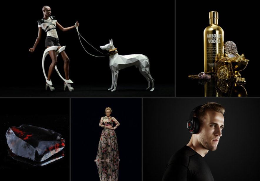
4. Search for source materials: Use the internet, books, magazines, newspapers, or other physical sources to find samples that will bring your keywords to life. You can even take photos of your own. Keep an eye out even when you aren’t actively searching.
5. Narrow down and coordinate your image selection. You don’t want to oversaturate your mood board; select a set that best represents your ideas concisely. Each sample counts – curate images that cover a wide range of aesthetic elements without being redundant. What element are you trying to highlight with each image?
6. Arrange the images in a way that looks good and makes sense. This might involve some re-sizing and Tetris skill. If you haven’t already, you might want to include a color swatch based on the images you’ve gathered. You might also choose to caption your images to clarify the ideas represented.
That’s all there is to it! Making a mood board for your video is a fun opportunity to flex your creative muscle, and you might get to admire some cool, aesthetically pleasing mood board examples while you’re at it. It’s an important piece that can really shape the look and feel of your production moving forward. Be true to your creative vision, keep in mind who you’re showing the mood board to, and above all, allow yourself to be inspired.

